
This paper will demonstrate a number of drawing styles that fall outside the normal concept of illustrations typically used in the field of urban design. It will trace a number of early examples of drawings that set the stage for explaining abstract data, and ultimately show the work of architects/urban designers that have utilized this concept.
I began to study urban design in 1979 with Colin Rowe at Cornell University. At Cornell we were taught to utilize a drawing tool called the figure-ground diagram. A figure-ground diagram is a two-dimensional map of an urban space that shows the relationship between built and unbuilt space. It is used in analysis of urban design and planning. It’s origins partly stem from the Nolli map which represents public space both within and outside buildings and also similar to a block pattern diagram that records public and private property as simple rectangular blocks. Simply put, The Nolli plan illustrates the relationship of public space, private space, and the in-between public-private space.
Traditionally the figure-ground drawing was constructed by hand, whereby the user traced over existing historic city plans, or aerial photographs. Today’s city figure-grounds are usually constructed using a computer to trace urban plans, or they can be easily obtained from various websites. One excellent site is SCHWARZPLAN.eu.
Although the figure-ground is an excellent tool for urban design I’ve always believed that used by itself it is rather lacking.
It is my belief that other existing urban design drawing styles need to be studied and used alongside the common ones typically found in a presentation. Some of these are presently being used by urban designers, but others can be found within other diagrammatic imagery. Images that are not commonly used by designers but could add to the process of crafty at an urban scale. My goal then is to depict other graphic styles which could be used or are presently being used but tend to not fit withing the ‘normal’ presentation format found withing urban design.
Historic Maps Illustrating Abstract Data
To begin let’s look at maps that urban designers commonly refer to when discussing a project. As an example, again the Nolli plan.
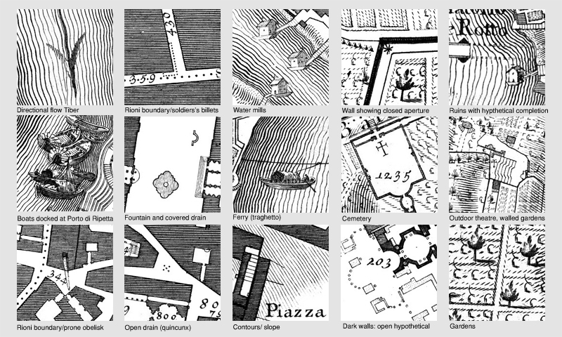

In both of these examples the small additions add to the composition of the maps as a whole and make them more then just tools for design, they also allow the images to stand alone as pieces of art.
When students in the United States are first are exposed to maps in elementary school the Rose Compass, the the concept of physical space is introduced. This then tends to limit a person’s belief that maps are solely used to demonstrate movement or a corporeal location.

Data Begins to be Graphically Shown in Unconventional Ways
During the 1800’s social reforms rise to the forefront of society. A number of key movements of the time are women’s suffrage, limits on child labor, abolition, temperance, prison reform, the study of class differences, and diseases within society.
In 1854, Dr. John Snow mapped data from a cholera outbreak in London. His map allowed him to see a clear pattern that no one had noticed yet and ultimately discover the source of the outbreak. Below is John Snow’s Map of 1854, showing the number of deaths from Cholera in the SoHo district of London. By talking to local residents (with the help of the Reverend Henry Whitehead), Snow identified the source of the outbreak as the contaminated public water pump on Broad Street (now Broadwick Street). As shown, he did this by mapping the deaths from cholera, and noted that they were mostly people whose nearest access to water was the Broad Street pump. His studies of the pattern of the disease were convincing enough to persuade the local council to disable the well pump by removing its handle. This action has been credited with contributing significantly to the containment of the disease in the area. It was later discovered that the water for the pump was polluted by sewage contaminated with cholera from a nearby cesspit.

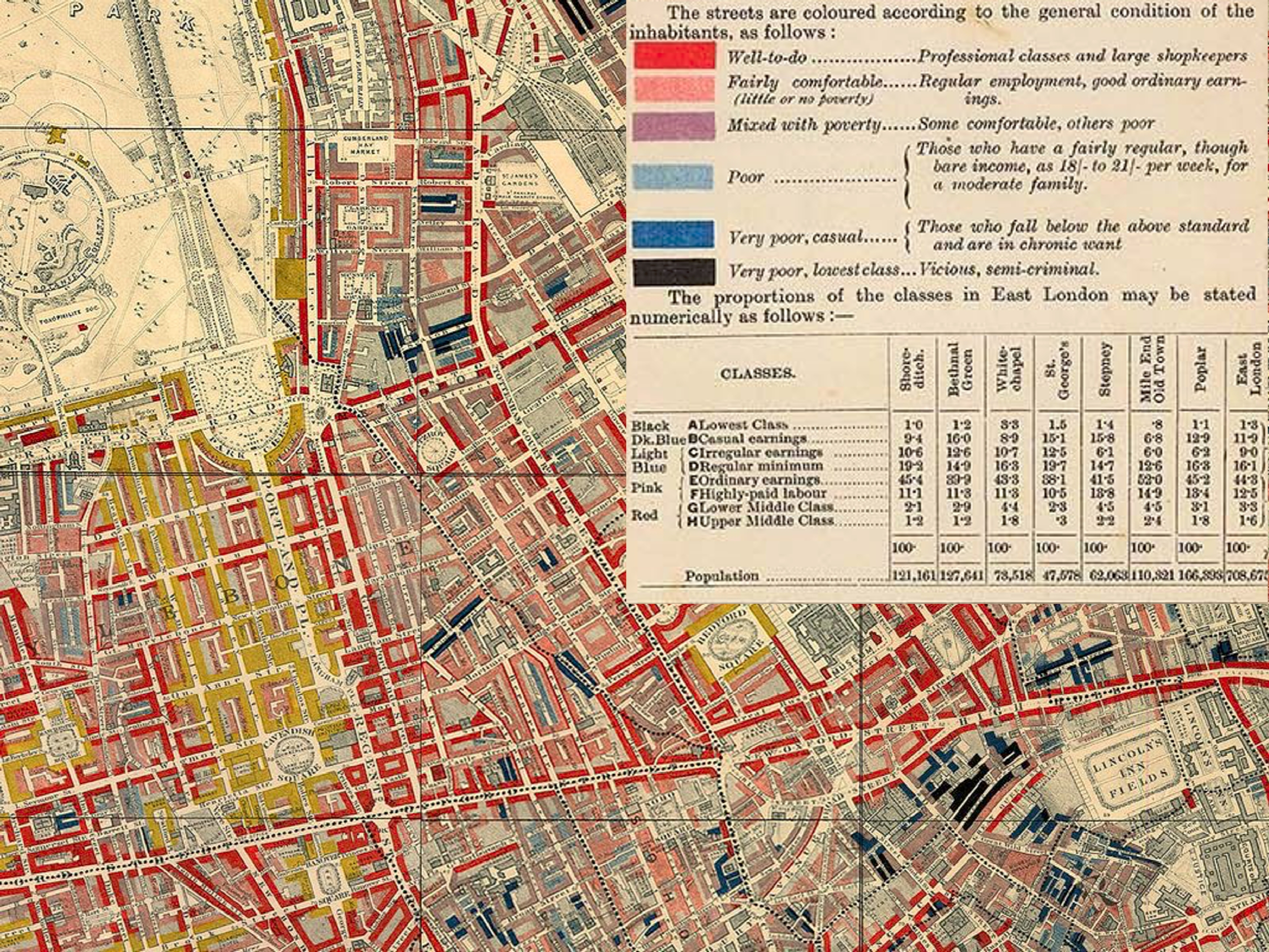
In 1886 Charles Booth and company produced the Poverty Map of London, which illustrated the location and range of classes in central London. The Booth Poverty map shows the income and social class of London’s inhabitants in the areas contained by Hammersmith, Hampstead, Greenwich, and Clapham. Booth color-coded each street to indicate the poverty level of its residents ranging from the lowest classes indicated by black shading to the upper-middle and upper classes indicated by yellow. This map provides invaluable insights into the social composition of late Victorian London.
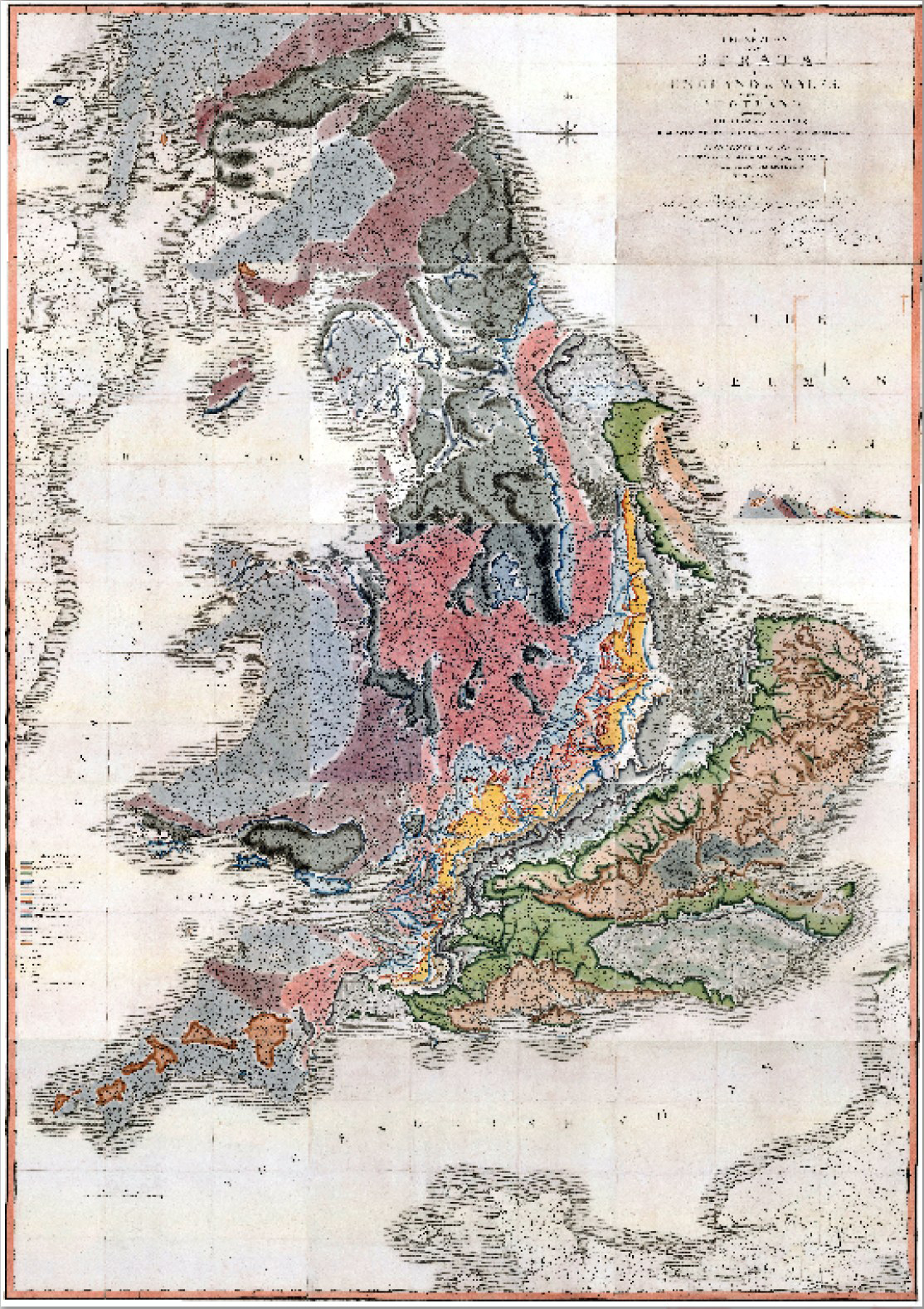
Other advances occurring in the 1800’s was those in the sciences. In 1815 the English geologist William Smith published a geological map, based on a John Cary map. It covered the whole of England and Wales, and parts of Scotland. While this was not the world’s first geological map (a map of the United States by William Maclure was published six years earlier), Smith’s was the first geological map covering such a large area in detail.
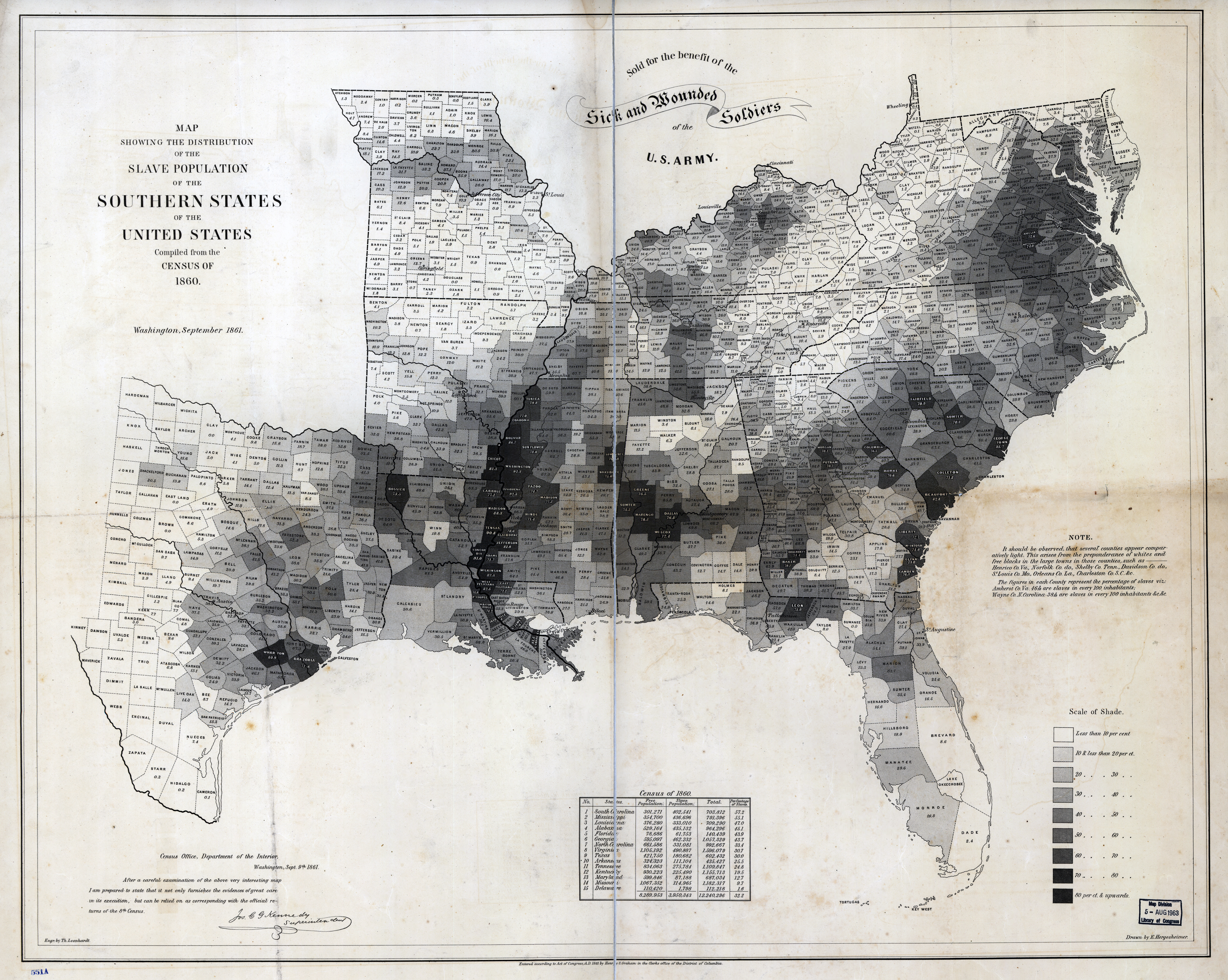
This next example shown below was created by the U.S. Coast Survey in 1861 by using census data from 1860. It shows the relative prevalence of slavery in Southern counties of the United States that year. The map, which shades counties based on the percentage of total inhabitants who were enslaved, illustrates what a range there was in levels of Southern enslavement. Some counties, the map explains, “appear comparatively light … this arises from the preponderance of whites and free blacks in the large towns in these counties.” The population of Orleans Parish, La., in one example, was 8.9 percent enslaved. Places that were rural but were located in mountainous areas devoid of plantations were similarly light-shaded: The people of Harlan County, Ky., were 2.3 percent enslaved. Meanwhile, a dark belt of counties bordering the Mississippi River held more than 70 percent of their residents in slavery, with Tensas Parish, La., at 90.8 percent and Washington County, Miss., at 92.3 percent.
Historian Susan Schulten writes in her book Mapping the Nation: History and Cartography in Nineteenth-Century America, that President Lincoln referred to this particular map often, using it to understand how the progress of emancipation might affect Union troops on the ground. The map even appears in the familiar Francis Bicknell Carpenter portrait First Reading of the Emancipation Proclamation of President Lincoln, visible leaning against a wall in the lower right-hand corner of the room.
From Johnson’s New Illustrated Family Atlas with Physical Geography, published in circa 1862, compares the worlds rivers in length at the same scale. Interestingly the author, for scale comparison, has drawn all the rivers stretched out and running north to south. The author essentially bends, or distorts, the actual graphic data to succeed in making their point. This illustration then leads to the next category of mapping uncommon data.

One series of maps, known for its graphic data and stand-alone beauty, are the Ancient Courses Mississippi River Meander Belt maps created by cartographer and geologist Harold Fisk for the U.S. Army Corps of Engineers. Each plate shows a different portion of the Mississippi river and its various courses through time between Cape Girardeau, Missouri (the most northern map) and Donaldsonville, Louisiana, (the most southern map) in various colors. Some of these channels date back thousands of years. The maps were part of Fisk’s report Geological Investigation of the Alluvial Valley of the Lower Mississippi River completed in 1944. The study was made to learn about the formation of the valley over time, and about the major factors that dictate its flow and flooding in the modern era.

In the aftermath of the Great Depression, the U.S. government set out to evaluate the riskiness of mortgages — and left behind a stunning portrait of the racism and discrimination that has shaped American housing policy. In the late 1930s, the Home Owners’ Loan Corporation “graded” neighborhoods into four categories, based in large part on their racial makeup. Neighborhoods with minority occupants were marked in red — hence redlining — and considered high-risk for mortgage lenders. Redlining was carried out in cities big and small, with the help of local realtors and appraisers. The maps and descriptions eventually made it into the National Archives.
Now a new digital tool, Mapping Inequality: Redlining in New Deal America, makes it easier than ever to see that history in high-resolution. The project features the infamous redlining maps from the Home Owners’ Loan Corporation.
The majority of the maps shown above are what I call ‘plan data maps,’ or data that is layered onto an orthogonal geographic map. With the advent of the computer this concept eventually develops into what we know today as Global Information Systems maps, or G.I.S.

This idea of mapping layered information has typically produced your common graphic ‘plan data maps.’ There exists though maps that fall outside these visually typical maps. These maps tend to deal with the concept of abstract data. Data that deals with movement, or three-dimensional space. This next section looks at some of these examples of conceptual abstract data.
Conceptual Abstract Data Mapped
The previous examples overlaid unconventional data on orthogonal special maps of cities or geographical locations. This chapter looks at data that is recorded in a way that allows the viewer to visual information in 2D and creates the concept of movement through time and three-dimensional space.
This first example demonstrates how one can graphically record dance steps, allowing a choreographer to recreate the dance at later date. The Beauchamp–Feuillet notation is a system of dance system used in Baroque dance, and was first established in the 1690’s. This system was not used solely to document the 2D plan aspect of a dance, but the gestures, and movement of the body in the 3rd dimension, such as leaping, and arm movements.

The next study is by Louis Kahn, titled Traffic Study project , Philadelphia, PA, 1952. This traffic study is an abstract plan in which Kahn proposes a new traffic pattern for central Philadelphia. Like the dance diagrams above, the drawing’s abstract coded system of directional arrows corresponds to different measures of traffic, such as the stop-and-go movement , the flow of traffic around the periphery, and the motionlessness of cars in parking garages.

Visually similar diagrams, which were produced with the early use of computers for the field of urban design, are called Space Syntax. Space Syntax was developed by a group at he Bartlett, University College in London. The term encompasses a set of theories and methods for the analysis of spatial configurations and movement. It was conceived by Bill Hillier, Julienne Hanson, and colleagues at The Bartlett in the late 1970s to early 1980’s and studies the practical relation between society and space.
A more recent study of movement through space was documented by photographer Eric Fischer, who uses Flickr’s geotags to create city maps that show the places of intense human interest. Fisher states, “…trace color indicates mode of transportation. Black is walking, red is bicycling, and blue is moving by motor vehicle. … I got the photo locations from the Flickr and Picasa search APIs. The base maps that they are plotted on top of are from OpenStreetMap. I wrote some perl scripts to identify and plot the clusters of locations. The scripts generate PostScript which I then converted to JPEGs using Ghostscript.” The yellow/green are the base roads.
This next example is considered by many to be the best statistical graphic ever drawn. Charles Minard, a French civil engineer, mapped Napoleon’s disastrous Russian campaign of 1812. The graphic is notable for its representation, in two dimensions, of six types of data: the number of Napoleon’s troops over time; distance; temperature; the latitude and longitude; direction of travel; and location relative to specific dates.

The abstract concept of movement can be applied to other elements besides the motion of humans. English Victorian polymath, Sir Francis Galton, was a psychologist, anthropologist, eugenicist, tropical explorer, geographer, inventor, proto-geneticist, psychometrician, statistician and the inventor of modern scientific meteorology. He was the father of the modern system of weather representation, as his book Meteorographica(Macmillan, 1863) was the first systematic attempt of gathering, charting and interpreting weather data on a continental scale. Similar to the dance diagrams listed above, weather mapping, documents the then abstract concept of weather movements and patterns.

This next example is from Bernard Tschumi’s The Manhattan Transcripts , which was developed between 1976-1981. Bernard Tschumi’s The Manhattan Transcripts is not simply about space and form, but also about event, action, and what happens in space. The Manhattan Transcripts differ from most architectural drawings insofar as they proposed to transcribe an architectural interpretation of reality. To this aim, Tschumi employed a particular structure involving photographs that either direct or “witness” the events. These events are sometimes called functions or programs. “… At the same time, plans, sections, and diagrams outline spaces and indicate the movements of the different protagonists intruding into the architectural “stage set.” The Transcripts’ explicit purpose was to transcribe things normally removed from conventional architectural representation, namely the complex relationship between spaces and their use, between the set and the script, between “type” and “program,” between objects and events. Their implicit purpose had to do with the 20th-century city.” (Refer to Bernard Tschumi Architects).

Later Bernard Tschumi won a major design competition in 1982–83 for his design of Parc de la Villette. This project is one of the first urban design developments that used the concept of palimpsest as a design tool. The figure/ground drawing shown below is from this authors book, The Genealogy of Cities.

These next two projects are early examples of drawings that investigate the concept of rendering three-dimensional space in an abstract manner.
The first drawing is from Daniel Libeskind’s “Micromegas & Chamberworks” (1979). Early in his career Libeskind produced two sets of drawings which reflected his thinking about the nature of architectural space. These drawings were developed from his interest in geometry, Micromegas could be considered an alternative blueprint, whilst Chamberworks explores the interaction between architecture and music, deeply rooted in his background and arguably one of his greatest influences. Both are visibly the basis on which Libeskind’s geometrically complex architecture was developed.

This second example is from Zaha Hadid’s paintings The World (89 degrees) produced in 1983.
From the Guggenheim’s website:
“Hadid’s paintings, which she views as “testing fields” for three-dimensional experimentation, played an important role in her efforts to expand the established notions of architectural space. Through her paintings, she explores spaces that architecture as a discipline has not considered before. This painting envisions the world without straight angles. An 89-degree world is comprised of acute forms that relate to each other in different ways. These new relations allow Hadid to render the horizon not as a single straight line, but as an expanded curve that incorporates adjacent spaces above and below.”
This final chapter will look at the product of…..
The Use of Mixed Media, or Collage, in Urban Mapping
Collage, from the French: coller, “to glue” or “to stick together” is a technique of art creation, primarily used in the visual arts by which art results from an assemblage of different forms, thus creating a new whole. A collage may sometimes include magazine and newspaper clippings, ribbons, paint, bits of colored or handmade papers, portions of other artwork or texts, photographs and other found objects, glued to a piece of paper or canvas. The origins of collage can be traced back hundreds of years, but this technique made a dramatic reappearance in the early 20th century as an art form.
One strongest influence in the use of collage in mapping is found in the work of El Lissitzky. In the image below, titled El Lissitzky The Constructor, Self-Portrait, Lissitzky produced the image by superimposing two separate photographs: the architect’s equipment (showing El Lissitzky’s hand holding a compass against graph paper with an arching line) and his self-portrait, both taken in 1924 while Lissitzky was recovering from tuberculosis in a Swiss sanatorium. The resulting image fuses the artist’s head, hand and tools. Large printed letters ‘XYZ’ , representing geographic mapped coordinates, appear in the top left-hand portion of the image.

Although not an actual map, Lissitzky’s strong geographic constructed line work is apparent in the later work of a number of subsequent designers, such as Thom Mayne, and Perry Kulper.
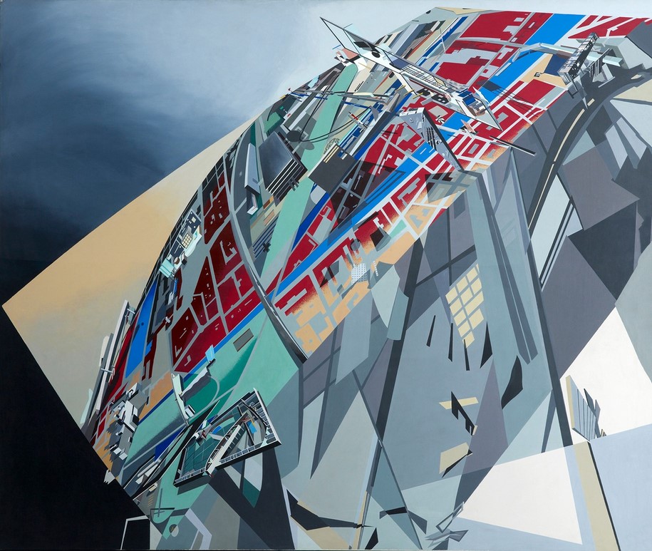
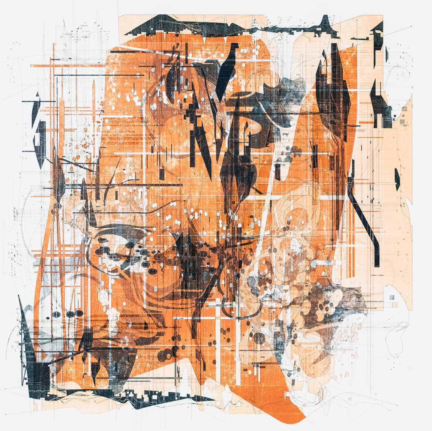
Thom Mayne, known for his experimental architectural forms, has used mixed media and collage since his early days of design. Below are three examples of conceptual site-plans, with the last two being siteless.


In these last examples I’ll be discussing Perry Kulper’s work. Perry Kulper studied at Sci-arc in southern California and work with Thom Mayne, who heavily influenced his work. Kulper is an architect whose work ranges from early orthographic drawings to mixed media techniques involving collage and, in most recent years, digital modelling and rendering. His practice is, as he describes, relying on an understanding of design as a kind of ‘relational thinking, framing objects, events, or conceptual frameworks, as structured relationships within the world.’

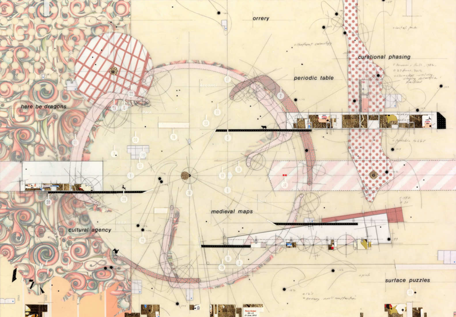

In Kulper’s later work he begins to use three-dimensional objects in his designs. Below are two examples of his use of combining these pieces to produce a final two-dimensional drawing.


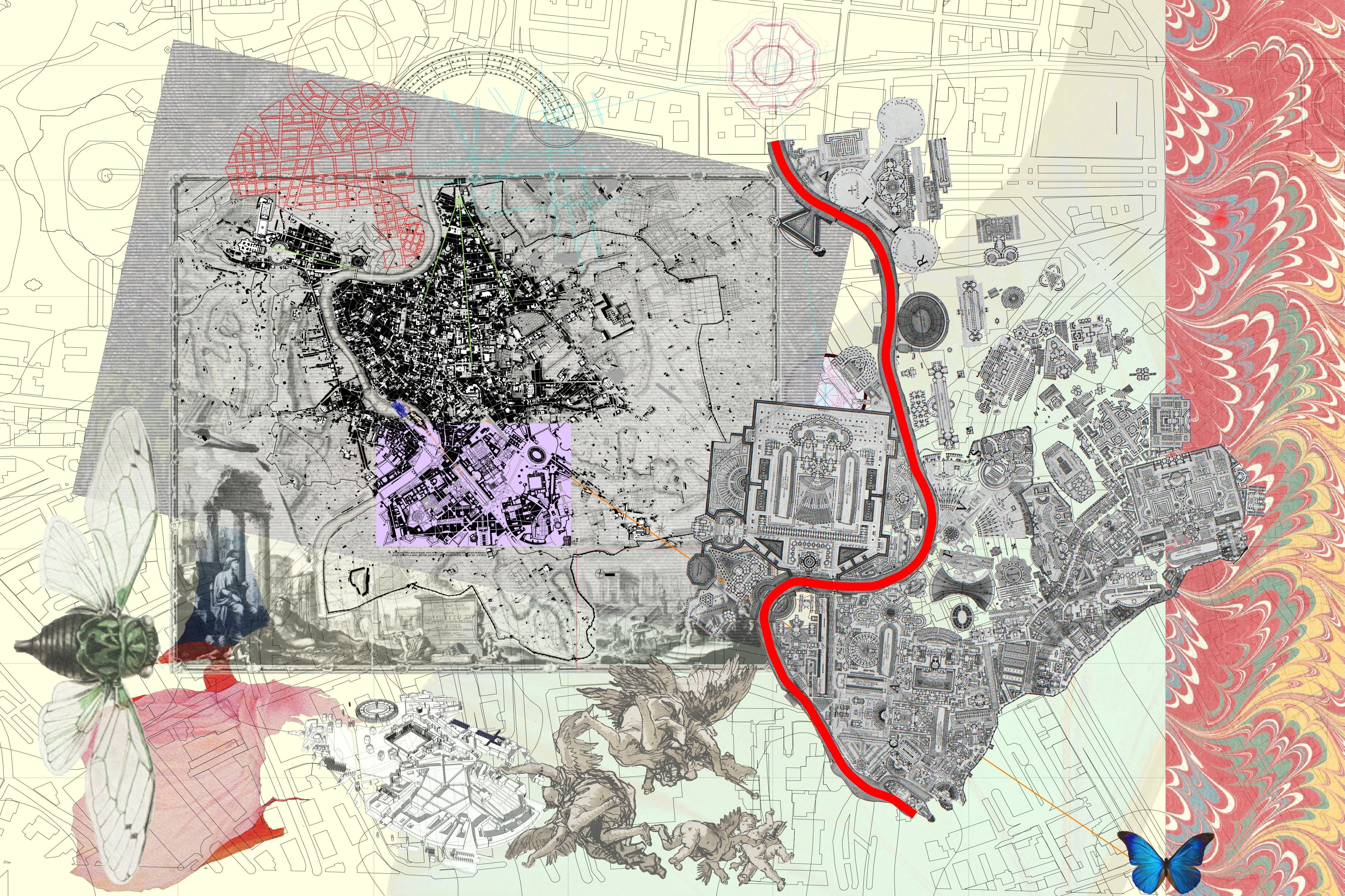
In the spring semester of 2018, I issued an early exercise to students based on the conceptual mixed media design process of Professor Perry Kulper. The students were asked to read the 1979 issue of A.D. Profile 20, Roma Interrotta and develop one drawing based on their understanding of Colin Rowe’s design for the competition. Below is a student example of their interpretation of the design.
So, what is the take-away from this article? If anything, I would hope that students and professionals of urban design will try to incorporate more types of investigative drawing types into their design process.
Let me be clear, I do not believe typical site design studies should be abandoned. As an example, these early studies by the firm Koetter/Kim for Blackwall Peninsula work well in informing the designers intent.

My intent with this article is to enlighten the reader to other manner of drawings styles and explain that there may be other forms of abstract data that could inform the design of an urban site.
Thank you for your time, and please feel free to comment.
Charles Graves, April 2021

2 Comments